

Introduction
Are you looking to optimize your data visualization with Tableau? Look no further! This blog post will provide you with the best practices and guidelines to help you get the most out of your Tableau experience. From understanding the fundamentals of Tableau to creating stunning visuals, this guide will provide you with the tools and tips needed to take your Tableau projects to the next level. Through learning the essential Tableau best practices and guidelines, you will be able to create impactful data visualizations that effectively communicate and represent your data.
Choosing the Right Chart Type for Your Data
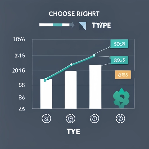
When it comes to data visualization, choosing the right chart type is crucial. It can make a significant difference in how effectively your data is understood and communicated. Luckily, Tableau makes it easy to determine the best chart type for your data.
Tableau provides a wide range of chart types, from bar charts and line graphs to scatter plots and treemaps. Each chart type has its strengths and weaknesses, and understanding these can help you select the most appropriate one for your data.
To choose the right chart type, start by understanding the variables in your data. Is it categorical or quantitative? Is it time-based or hierarchical? Tableau provides guidelines and suggestions on which chart types work best for different data types. Additionally, consider the message you want to convey. Are you comparing values? Showing trends over time? Displaying parts of a whole?
Tableau’s intuitive interface and extensive documentation make it easy to experiment and find the best chart type for your data. With Tableau, you have the power to create impactful visualizations that effectively communicate your data’s story. So, why not dive in and explore Tableau’s vast array of chart types to optimize your data visualization?
Here are some reference materials for choosing the right charts.
Maximizing Dashboard Performance
When it comes to creating data visualizations in Tableau, dashboard performance is key. You want your dashboards to load quickly and respond seamlessly to user interactions. But how can you achieve optimal performance?
Tableau provides several best practices to help you maximize the performance of your dashboards. First, consider the size of your data. If you have large datasets, it’s important to optimize your data sources and use filters to reduce the amount of data being loaded into memory.
Another tip is to minimize the use of complex calculations and aggregations. These can slow down dashboard performance, especially if they are being computed in real-time. Instead, pre-calculate your calculations and use extracts for faster results.
Furthermore, organizing your dashboard layout effectively can also improve performance. Avoid overcrowding your dashboard with too many worksheets or elements. Keep it clean and simple, focusing on the key visualizations that convey your message.
Lastly, make use of Tableau’s performance recording feature to identify any performance bottlenecks and optimize your dashboards accordingly.
By following these best practices and guidelines, you can ensure that your Tableau dashboards perform at their best, providing users with a smooth and efficient data visualization experience. So, dive in and discover how to maximize dashboard performance in Tableau!
Here is a link to Tableau’s recommendation on how to optimize your Tableau workbooks.
Formatting Tips and Tricks for Better Visualizations
Formatting is an essential aspect of data visualization that can greatly enhance the impact of your visualizations. In Tableau, you have a variety of tools and techniques at your disposal to create visually appealing and engaging visualizations.
One of the key formatting tips in Tableau is to ensure consistency in your visualizations. This means using a consistent color palette, font style, and sizing across your dashboards. Consistency not only improves the overall aesthetic appeal but also helps users to navigate and interpret the information easily.
Another important formatting tip is to leverage Tableau’s formatting options to highlight key insights in your data. Use color coding, bold fonts, and size variations to draw attention to important data points or trends. You can also use annotations and tooltips to provide additional context and information to your visualizations.
Additionally, consider the layout and spacing of your visualizations. Tableau allows you to easily arrange and organize your visual elements, ensuring a clean and professional appearance. Utilize grids, containers, and padding options to create a visually appealing layout that is easy to comprehend.
Lastly, don’t forget to consider the audience when formatting your visualizations. Adjust your formatting choices based on the context in which the visualizations will be viewed. For example, if your visualizations are intended for a presentation, consider using larger fonts and bold colors for better visibility from a distance.
By implementing these formatting tips and tricks in Tableau, you can elevate your visualizations from good to great. Tableau provides a multitude of options to enhance the appearance and readability of your visualizations, so don’t be afraid to explore and experiment with different formatting techniques.
Visit the Power of Data Visualization best practices blog post.

Creating Effective Calculations and Metrics
Creating effective calculations and metrics is a crucial aspect of data visualization in Tableau. With Tableau’s powerful calculation capabilities, you have the tools to dive deep into your data and derive meaningful insights.
To create effective calculations and metrics in Tableau, start by understanding the data you are working with. Take time to explore and analyze your data to identify the key metrics that align with your visualization goals. Once you have a clear understanding of the metrics you want to calculate, Tableau provides a user-friendly interface to create calculations.
Tableau offers a wide range of calculation functions, from basic arithmetic operators to advanced statistical functions. By leveraging these functions, you can perform complex calculations and transform your raw data into meaningful metrics.
In addition to the built-in calculation functions, Tableau also allows you to create calculated fields, which are custom calculations specific to your analysis. Calculated fields can be created using simple formulas or more advanced logic, allowing you to manipulate and transform your data to fit your visualization needs.
Tableau also offers the ability to create table calculations, which enable you to perform calculations based on the values in a specific column or row. These calculations can be useful for creating running totals, percent of totals, and other types of comparative analysis.
By mastering the art of creating effective calculations and metrics in Tableau, you can unlock the full potential of your data and create insightful visualizations that tell a compelling story. So, dive into Tableau’s calculation capabilities and start exploring the endless possibilities.
Visit the Table Calculations blog post for tips and tricks.
Best Practices for Data Blending and Joining

Data blending and joining are powerful techniques in Tableau that allow you to combine and analyze data from multiple sources. Whether you need to blend data from different databases or join tables within a single source, Tableau provides the tools and functionality to make it happen.
To ensure successful data blending and joining in Tableau, it’s important to follow best practices. First, start by understanding the structure and relationships between your data sources. Take the time to map out the key fields and identifiers that will be used for blending or joining. This will help ensure accurate and meaningful analysis.
Next, consider the performance implications of your data blending and joining operations. Depending on the size and complexity of your data, you may need to optimize your data sources or use data extracts to improve performance. Tableau’s documentation provides detailed guidance on optimizing data blending and joining for optimal performance.
Lastly, don’t forget to validate and test your blended or joined data to ensure accuracy. Tableau provides tools such as data quality warnings and data source validation to help identify any issues or discrepancies in your data.
By following these best practices, you can leverage Tableau’s data blending and joining capabilities to gain valuable insights and make more informed decisions. So, dive into Tableau and discover how to effectively blend and join data to take your analysis to the next level.

Collaborating and Sharing with Others in Tableau
Collaborating and sharing your Tableau visualizations with others is an important aspect of the data visualization process. Tableau offers a range of features and tools that make it easy to collaborate and share your work with colleagues, clients, and stakeholders.
To collaborate effectively in Tableau, you can use features such as commenting and annotations to provide feedback and discuss insights with others. Tableau also allows for version control, enabling you to track changes and collaborate on projects with multiple team members.
When it comes to sharing your visualizations, Tableau offers various options. You can publish your dashboards and visualizations to Tableau Server or Tableau Online, allowing others to access and interact with your work. Additionally, you can export your visualizations to different file formats, such as PDF or image files, for easy sharing via email or presentation.
To ensure seamless collaboration and sharing, it’s important to consider the intended audience and their needs. Tableau provides options to set permissions and access controls, allowing you to control who can view, edit, and share your visualizations.
In conclusion, Tableau offers a range of features and tools for collaborating and sharing visualizations with others. By understanding how to effectively collaborate and share in Tableau, you can enhance teamwork and ensure that your visualizations reach the right audience. So, dive into Tableau’s collaboration and sharing features and start sharing your data-driven insights with the world.
To swiftly document your Tableau dashboards and also capture Tableau dashboard images, saving you an impressive 8–10 hours per workbook, explore the efficiency of RapidDox.
Disclaimer: Above views and recommendations are purely my personal views in personal opinion. These opinions are not the perspectives of my current or previous employers.