

Introduction
Data visualization is one of the most powerful tools to communicate complex information in an easily understandable manner. It allows us to see the data in a visually appealing and meaningful way, and it can help us unlock the power of visual communication. In this blog post, we will explore the best practices for data visualization, and how they can help you effectively present data in a way that makes it easier to understand and interpret. We’ll also discuss the guidelines that should be followed to ensure that your data visualizations are easy to read and aesthetically pleasing.
Why Data Visualization Matters

Data visualization matters now more than ever. In today’s data-driven world, we are constantly bombarded with a vast amount of information. It can be overwhelming to sift through raw data and make sense of it all. This is where data visualization comes in.
By presenting data in a visually appealing and easy-to-understand way, data visualization allows us to quickly grasp the key insights and trends hidden within the numbers. It helps us tell a story with data, making complex information more accessible and digestible for a wide audience.
Tableau and Power BI are two powerful tools that can take your data visualization to the next level. With their user-friendly interfaces and wide range of customizable options, these tools enable you to create stunning visualizations that effectively communicate your data.
But data visualization is not just about aesthetics. It also enhances decision-making by enabling us to spot patterns, identify outliers, and draw conclusions faster. Whether you are a data analyst presenting insights to stakeholders or a researcher analyzing complex datasets, data visualization allows you to make data-driven decisions with confidence.

Understanding Your Audience and Purpose
To create effective data visualizations, it is crucial to have a deep understanding of your audience and purpose. Before you dive into creating charts and graphs, take a step back and ask yourself who will be consuming your data and what message you want to convey.
Understanding your audience is key to tailoring your visualizations to their needs and preferences. Are they data analysts who crave detailed insights? Executives who need a high-level overview? Or maybe they are the general public who have little to no background in data analysis? By knowing your audience, you can adjust the level of complexity, choose the appropriate visualizations, and highlight the most relevant information.
Equally important is understanding the purpose of your visualization. Are you trying to uncover trends, showcase comparisons, or illustrate patterns? Are you presenting the data to inform a decision, persuade stakeholders, or tell a compelling story? The purpose of your visualization will drive the design choices you make, including the selection of data elements, colors, and interactivity.
Fortunately, tools like Tableau and Power BI offer a range of customizable options that can help you create visualizations tailored to your audience and purpose. From selecting the right chart types to adding interactive features, these tools empower you to create visualizations that effectively communicate your data.
Choosing the Right Type of Visualization

Choosing the right type of visualization is essential to effectively communicate your data and convey your message. With so many options available, it can be overwhelming to determine which visualization type is best suited for your data. But fear not, because we’re here to help you navigate through the sea of choices.
Tableau and Power BI are two powerful tools that offer a wide range of visualization options, making it easier for you to find the perfect fit for your data. Whether you’re looking to showcase comparisons, illustrate patterns, or uncover trends, these tools have got you covered.
When choosing the right type of visualization, consider the nature of your data and the insights you want to highlight. Line charts and area charts are great for tracking trends over time, while bar charts and column charts are effective for comparing categories. Scatter plots are ideal for identifying correlations, and pie charts are perfect for showing proportions.
It’s also important to consider the level of interactivity you want to provide to your audience. Tableau and Power BI allow you to add interactive features such as filters and drill-down capabilities, enabling your audience to explore the data on their own terms.

Design Principles for Effective Data Visualization
Effective data visualization relies on a strong foundation of design principles that ensure clarity, simplicity, and coherence. By following these principles, you can create visualizations that are not only aesthetically pleasing but also effectively convey your message.
One key principle is to keep your visualizations simple and uncluttered. Avoid overwhelming your audience with too much information or unnecessary elements. Instead, focus on presenting the key insights and trends in a clear and concise manner. Use visual cues such as color, size, and position to guide the viewer’s attention to the most important elements.
Another important design principle is to ensure that your visualizations are easily understandable. Use clear and descriptive titles, labels, and annotations to provide context and explain the meaning of the data. Consider the audience’s level of familiarity with the subject matter and adjust the level of complexity accordingly.
Consistency is also crucial in effective data visualization. Use a consistent color scheme, font style, and layout throughout your visualizations to create a cohesive and professional look. This helps to establish visual patterns and aids in the viewer’s comprehension of the information.
Finally, always consider the context in which your visualizations will be presented. Think about the medium in which they will be viewed, such as a presentation slide or a website, and optimize the design accordingly. Pay attention to the size and resolution of your visualizations to ensure they are legible and accessible to your audience.
By applying these design principles, you can create data visualizations that are not only visually appealing but also highly effective in communicating your message.
Color Theory and Selection
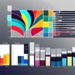
Color plays a crucial role in data visualization. It not only enhances the aesthetic appeal of your visualizations but also conveys meaning and aids in understanding the data. Color can be used to highlight important information, differentiate between categories, and create visual patterns that guide the viewer’s attention. However, using color effectively requires an understanding of color theory and careful selection of colors.
Color theory is the study of how colors interact with each other and how they are perceived by the human eye. It provides a set of guidelines and principles that can help you create harmonious and visually pleasing color schemes. One important principle is the use of color contrast. High contrast between colors can make it easier to distinguish between different elements, while low contrast can create a more subtle and cohesive look. Consider using contrasting colors for important data points or categories to make them stand out.
Another aspect to consider is the emotional impact of colors. Different colors evoke different emotions and associations, so it’s important to choose colors that align with the message and tone you want to convey. For example, warm colors like red and orange are often associated with energy and excitement, while cool colors like blue and green are associated with calmness and stability. Take into account the psychological impact of colors and use them strategically to enhance the message of your visualizations.
When selecting colors, it’s also important to consider accessibility. Ensure that your color choices are easily distinguishable by people with color blindness or visual impairments. Avoid relying solely on color to convey information, and provide alternative ways of differentiating between categories, such as using different shapes or patterns in addition to color.
Tools like Tableau and Power BI offer built-in color palettes and color schemes that can help you create visually appealing visualizations. These tools also allow you to customize colors to match your brand or personal preferences. Experiment with different color combinations and pay attention to how they impact the clarity and readability of your visualizations.

Using Interactivity to Enhance User Experience
Using interactivity in data visualizations can greatly enhance the user experience and make the data more engaging and interactive. By incorporating interactive features, such as filters, tooltips, and drill-down capabilities, you allow your audience to explore the data and gain deeper insights on their own terms.
Interactive visualizations enable users to interact with the data, providing them with a sense of control and empowerment. They can filter and sort the data to focus on specific subsets, zoom in on certain areas of interest, and interact with different elements to uncover hidden patterns or outliers.
In addition, interactivity allows for a more dynamic storytelling experience. By incorporating interactive elements, you can guide your audience through the data, presenting information in a more engaging and memorable way. Users can interact with different parts of the visualization to reveal additional information or toggle between different views to compare and contrast data points.
Furthermore, interactivity can help simplify complex data by providing context and explanations. Tooltips and interactive legends can be used to provide additional information or definitions for specific data points, making it easier for users to understand the meaning behind the numbers.
Avoiding Common Mistakes in Data Visualization

Data visualization is a powerful tool that can transform complex data into visually appealing and easily understandable representations. However, it is important to be aware of common mistakes that can hinder the effectiveness of your visualizations. By avoiding these mistakes, you can ensure that your data is accurately and clearly communicated to your audience.
One common mistake in data visualization is using too much information. It can be tempting to include every data point and detail, but this can overwhelm and confuse your audience. Instead, focus on the key insights and trends that you want to convey. Keep your visualizations clean and uncluttered, and use visual cues to guide your audience’s attention to the most important information.
Another mistake is choosing the wrong type of visualization for your data. Each type of visualization has its own strengths and weaknesses, so it’s important to select the one that best fits your data and message. Consider the nature of your data, the insights you want to highlight, and the preferences of your audience. This will help you choose the most appropriate visualization type to effectively communicate your data.
In addition, be mindful of the colors you use in your visualizations. While colors can enhance the aesthetic appeal and convey meaning, using too many colors or inappropriate color combinations can confuse or distract your audience. Stick to a cohesive color scheme that aligns with the message and tone of your visualization, and ensure that the colors you choose are easily distinguishable by all viewers, including those with color blindness.

Tools and Resources for Creating Stunning Visuals
Creating stunning visualizations requires the right tools and resources. Thankfully, there are a multitude of options available to help you bring your data to life. Tableau and Power BI are two powerful tools that offer a wide range of features to enhance your data visualization journey.
Tableau is known for its user-friendly interface and robust functionality. It allows you to easily connect to different data sources, create interactive dashboards, and customize visualizations to suit your needs. With Tableau, you can explore, analyze, and present your data in a visually captivating way.
Power BI, on the other hand, is a powerful business intelligence tool that integrates seamlessly with Microsoft products. It offers a variety of visualization options and allows for easy collaboration and sharing of dashboards and reports. Power BI also offers advanced analytics capabilities, such as AI-powered insights and natural language querying, to further enhance your data visualization experience.
In addition to these tools, there are numerous online resources available to help you improve your data visualization skills. Websites like Data Visualization Society, FlowingData, and Tableau Public provide inspiration, tutorials, and best practices to help you create stunning visuals. Online courses and communities, such as Coursera and Reddit’s Data Is Beautiful subreddit, offer opportunities for learning and collaboration.
Tableau and Power BI indeed stand as excellent data visualization tools. Don’t miss the opportunity to explore further insights by visiting our blog post comparing Tableau and Power BI.
Whether you’re working with Tableau or MS Power BI when you need to effortlessly extract metadata or generate comprehensive documentation for your dashboards in mere seconds, thereby conserving 8–10 hours per workbook, consider giving RapidDox a go.
Disclaimer: Above views and recommendations are purely my personal views in personal opinion. These opinions are not the perspectives of my current or previous employers.